The World’s Ugliest Color Will Have You Kicking This Deadly Habit
Ugly has never looked quite so good.
You might want to start paying attention to what your outfit color says about you. Apart from getting you more Instagram likes, research shows that certain hues could actually be a huge turnoff. But if you ask us, this shade is also an amazing lifesaver—and here’s why.
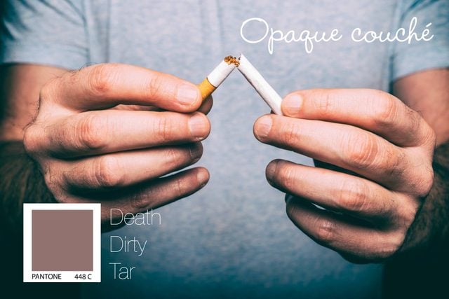
The world’s ugliest color goes by the name Pantone 448 C, or “opaque couché” for short, TIME reports. As a “drab, dark brown” shade, this particular pigment has been described as “death,” “dirty,” and “tar.”
Disgusted already? That’s probably a good thing. The color was selected after three months of multiple studies conducted by research agency GfK Bluemoon. Their research, funded by the Australian government, aimed to find the most repugnant color for a very specific purpose: to discourage smoking.
It was “the antithesis of what is our usual objective,” Victoria Parr, lead market researcher for GfK, said. “We didn’t want to create attractive, aspirational packaging designed to win customers … Instead our role was to help our client reduce demand, with the ultimate aim to minimize use of the product.”
Now, the new color has been placed on all tobacco packaging in Australia—along with graphic health warnings—in the hopes of suppressing national tobacco use. And so far, it seems to have worked! The Guardian reports that cigarette sales have started to decline in Australia.
The United Kingdom, Ireland, and France plan to follow suit, passing similar anti-smoking laws within their own borders. They also plan to use tobacco packaging colored the same dismal shade. Still, until the trend makes its way across the Atlantic, you won’t want to find Pantone 448 C in your closet (or your home!) anytime soon.
Next, check out why money is green—and other fun facts about color.


